One of my main motivations to switch over to Android, was to be able to set up the device just the way I want to. The way it suits my needs and wishes the best. Which is good, simply because, and yes, you guessed right: I get to tinker again.
For a while now, I was using the Google Launcher, and was (and still am) very satisfied with it. I like to have Google Now right there on the left screen, so I wasn’t much motivated to switch to another launcher. Yet, and I wrote about this already in my last post, I was giving Action Launcher a try.
Action Launcher 3 has quite a few nice and compelling features, which enable a rather sophisticated setup while at the same time keeping the home screen nice and clean. The cover feature, which uses the first icon in a folder as a cover, and doubles as a shortcut to launch said app is such an example. Despite having found a very nice setup, I continued to switch back and fourth between it and the Google Launcher.
The other day, I had some new ideas to improve my home-screen and am sporting it ever since. On first sight it appears rather basic, but with this launcher, the more sophisticated things are under the hood.
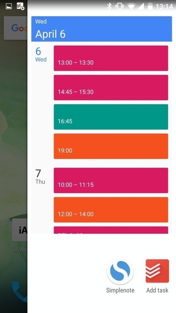
Currently I use three screens: the main home-screen and two which sport my Todoist and Evernote widgets as large as possible. Then there is the drawer on which I have added some essential widgets and shortcuts as well as the calendar widget. The icons on the first screen are arranged in a way that I can navigate and get to my most important or commonly used tasks only with my thumb. !
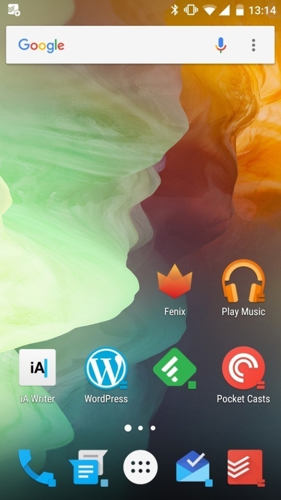
In this setup the icons the Feedly, Inbox, Messages and Phone icons double as an application shortcut as well as an folder cover. The Feedly folder for example contains all my reading apps such as: Nuzzel, Play Newstand, Pocket, Medium, Kindle, Google+ and so on. The Inbox folder contains all Google apps. The phone- and messages-folder contain shortcuts to my most used contacts and messaging apps. Both the Pocket Casts and Google Music icon reveal on swipe the apps widget. This comes in very handy if I want to quickly continue to listen what I have been listening earlier.
I like this setup and will continue using it for the time being. Choice is surely one of the benefits of using Android over iOS and finding a or the setup that works for me is one of those. If I ever will find a decent wallpaper though is a totally different story.
Posted in: Journal • Homescreen