I know it’s been a while and I needed to search a bit until I found the last home-screen post . Even though it looks similar, a lot of things have happened in between.
At some point during the last year, the erratic touch-behavior of my phone has annoyed me one time too much and I went back to the iPhone 6plus which I had still lying around. During the few weeks that I was using it, it learned again that I so much more prefer to use Android. I don’t know, something happens with me when I start using iOS, and whatever that is, I don’t like it. So I went back.
One issue with all things Android is the lack of timely security updates. It has gotten a lot better over the last years though and a lot of, almost system-like, updates happen in a kind-of-stealth way. Still it would be nice using the latest version of the OS, even when not using a Pixel phone, which is not even available here (I know there are workarounds, don’t @-reply me).
In comes Nokia. The new Nokia phones feature a pure-Android experience, so far are up-to-date, and come at a reasonable price point. My Nokia 8 sports the current latest OS and security update. Which is great. The upcoming models will even run on Android One, and be possibly (or even more likely) equally well updated.
This phone is the first one that I use which features the native Android launcher (albeit not the Pixel-Launcher) yet ironically I still prefer to use Action Launcher to mimic the Android launcher’s behavior with swipe left for Google Now plus, and this is the important part, my own additions.
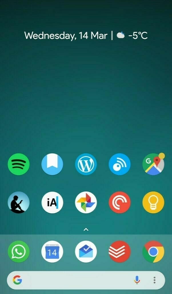
As in my earlier home-screens, everything is there where I want it and most of the icons double as a folder or have more than one function. For example:
Pressing the Todoist-icon opens the app (no kidding), long-pressing opens the* app-shortcuts* and swiping-up on the icon opens a pre-configured widget with a Todoist filter. The maps icon also opens my Google folder and so on. Built into Action Launcher is swipe-down for notifications, which is something that I don’t want to miss.
Then there is the quick page, with some shortcuts to chats, folders and other actions. Swipe-right opens the Google app and so on. In short: there is a lot of swiping going on there.
As for the apps, the Keep icon is where Dialog, a 3rd-party app for Micro.Blog app is going to end up, but all other apps I use frequently. Well, maybe Day One is one of those applications, that I seriously have to re-think. But that is something for another post.
Overall, I am very satisfied with this setup, and haven’t had the urge to tweak it even further. I might give the built-in launcher another try, but let’s see about that.
Posted in: Journal • Homescreen